Monday, May 05, 2008
Sunday, December 17, 2006
Elizabeth King
 During the days when I wandered the neighborhood around the State Department I also saw this at the old Nancy Drysdale Gallery. It has since been purchased by the Hirshhorn, though I've never seen it exhibited there. Interested persons can learn more about this amazing artist from her book Attention's Loop.
Ignacio Iturria
 I found this painting of Iturria's on the internet a few years ago. I have never seen the actual painting though I am familiar with other works by this contemporary artist. I used to work in the State Department in Washington, DC, and would wander around the surrounding neighborhood during my lunch hour. An exhibit at the Museum of the Americas nearby was featuring an exhibit on Iturria. It was wonderful (though some of his pictures had a few conservation problems). The surfaces were very painterly, very brown -- kind of a modern, whimsical take-off on Rembrandt. The subject matter was crazy -- funny, child-like, imaginative. The scale was large -- and large in a way that means something. His skyscrapers on tabletops seem the size they should be -- actually they seem "life-size," though that is a bit of a paradox.
After we got a computer and I started surfing the internet, Iturria was one of the artists I looked for. After the exhibit but before my introduction to the internet, I knew his work only from ArtNews magazine where it was being advertised by Praxis. Now we can "google" him and see images, and meanwhile our local modern museum, the Hirshhorn, has added one Iturria to its collection though not a particularly good one.
Would that the Hirshhorn had been able to buy this one! Click on the image to see it enlarged enough to spy a cow giving milk into one of the cups. In the "art world" where "edgy-ness" rules, Iturria seems to be one of the few serious contemporary artists humane enough to use humor -- and to use it plainly, unapologically and with wonderful kindness.
Influence
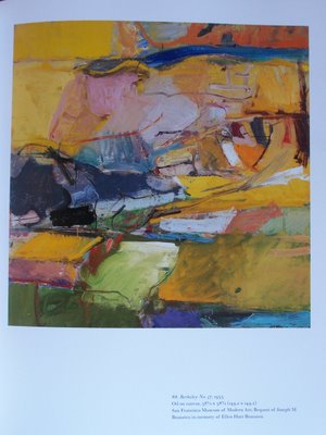
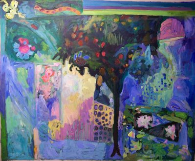

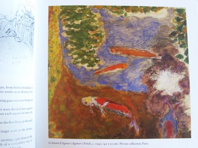 The images posted here illustrate some of the general sources for my recent paintings -- particularly the ones of gardens and water (such as "Garden Tree" the second image from the top). At the top of the column is one of Diebenkorn's "Berkeley" pictures as illustrated in Jane Livingston's book on the artist. Below my painting (third from the top) is a section from the Garden Fresco from the House of Livia at Primaporta. You can find it in the book Domus. And the last picture is of Bonnard's painting Le Bassin d'Agenor, which shows his fish swimming in a little pool. I borrowed Bonnard's Agenor for my painting of the same name. The photo posted here comes from Michel Terrasse's book Bonnard at Le Cannet.
My painting Garden Tree is acrylic on canvas, approximately 100 x 90 inches.
[To see more Bonnard images: click on the word "Influence" above and see images from a recent exposition of his Le Cannet works.]
Van Gogh and Me
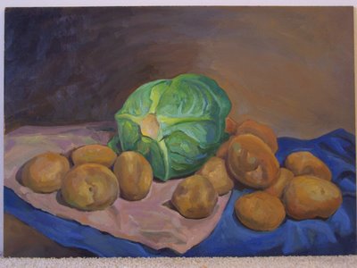 I painted this about twenty years ago. It was my way of connecting to Van Gogh's early paintings of humble objects in dark tonalities. For all that, it's a very American picture. There's something frank about these vegetables that makes them more ordinary than humble. I got them at the grocery store (I didn't grow them).
 Young artists are discouraged from engaging the art of the past in a direct way, and even if someone were to imitate Van Gogh, they'd be advised to look at the bright "modern" pictures. But all Van Gogh's images grew out of his peculiar personality and early and late works are equally his.
And my imitation of Van Gogh is uniquely mine. I drew something after Van Gogh's manner the way that Van Gogh himself explored the imagery of Rembrandt, Delacroix and Millet -- the way that Matisee explored images of Cezanne's, the way Diebenkorn borrowed from Matisse, and so on. You don't reinvent the wheel. You don't imitate the wheel exactly either. In this case -- you contemplate it.
Why I Paint
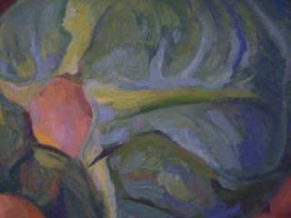
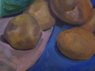
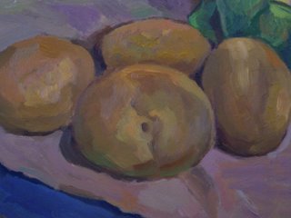
 I love looking at things, observing ordinary objects, watching colors and shapes: the world as we perceive it has its own raison d'etre. The contours of a potato, the way light changes along a round surface, the shapes and interiors of shadows, the variagations in color -- all these things that you can observe in objects by simply opening your eyes make painting enchanting.
Saturday, December 16, 2006
Tree (which appears earlier on this blog)


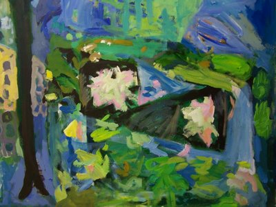 The picture third from the top shows the first of my paintings of the "lattice" theme and illustrates how the painting looks at present. An earlier incarnation of the painting was featured in a previous post. I removed the lattice element, and now the composition focuses more on the tree itself. The pictures immediately above and below it show details of the painting (including a nest of baby birds that are based on my young daughter's drawings).
 I also borrowed imagery from what might seem an unlikely source: from Gerard David's Wedding Feast at Cana.
In David's painting -- in the upper right corner -- a tapestry hangs behind the bride: some details of that floral tapestry have become the fruit and flowers in my tree. My painting borrows from numerous other sources as well. Each borrowing probably steals meaning as well as imagery.
Dundee Still life
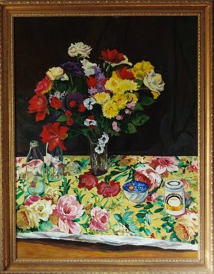 This is one of my favorite paintings (of my own). I love the pattern on the cloth that is so active and dimensionally ambiguous that the flowers of the cloth seem as real or more real than the flowers in the vase. I love the painting-with-the-painting of the marmelade jar, and I love the distortions through the glass jars and the way the cloth really flattens out near the horizon.
Some of the effects in this painting were "accidents." I didn't know how to consistently paint the cloth so that the foreground parts of its design would flatten out as effectively as in the rear. And I had to assemble and disassemble the still life each time I worked (or the space of a month) because if I left it out my cat would overturn the objects. So things weren't always put back into their exact positions which added to my confusion.
But I love the confusion. I love the mistakes I made. The mistakes turned out to have meaning in them, and thus they were the most fortuitous mistakes one could want. It's a very personal work.
Duck of a Different Color
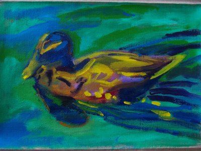 Sometimes people inadvertently impose all sorts of rules upon themselves in making art. Art is supposed in the popular imagination to be "free," yet artists succumb to the usual doubts and frictions of life that lead to rules -- "never do this, always do that." I recall hearing someone or other tell me that you need a certain amount of light or certain kind of light to be able to paint. Certainly you should not paint in light so dim that you cannot see the colors. Yet that is exactly what I did with this duck. I painted it (from a photo -- another no-no) in light dim enough that I only knew my colors from the lables on the tubes.
 I did know
I was making the water green. But other relationships were not so obvious. And consequently the colors (though not the tones) of this little painting are exaggerated. And that's what I like about it.
Matisse painted very exaggerated colors in optimal light. But you can paint in poor light as well -- especially when you are being curious -- when you are just making an image to see where it leads.
Neighborhood Girl
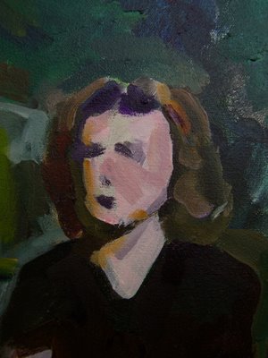
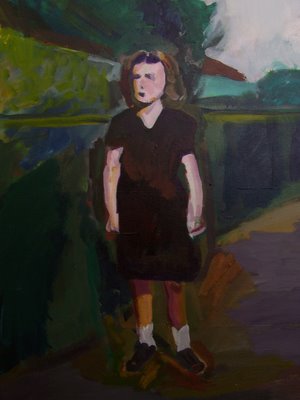
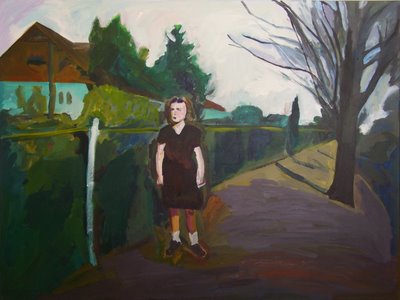
The girl stands in front of a yard beside a long street receeding deep into the distance. The near monochrome of the colors -- deep greens, pale and dark greys and warm browns -- evokes a nostalgic past. The girl stands out from her surroundings in a doll-like way by the rough painting of colors and the summarized handling of her pose.
Koi Swimming
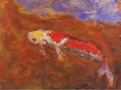
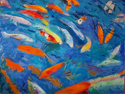 This painting is an oil version of a painting that appears on an earlier blog. It's also a larger version. Revisiting the image in the oil medium creates a different surface, and the difference in scale makes a different and somewhat bolder impact. On of the fish in the pool where these fish live was nick-named "Moby Dick."
 Friday, December 15, 2006
Micro Mega
 The painting "Lattice" above is very large -- about 83 inches square while the little collage below is very small, under seven inches. Yet they have very similar formal structures.
  Sometimes you repeat yourself in intriguing ways -- in ways you are not aware of -- and then you learn about the hidden structures of your own thoughts. It's like dreaming. It's like giving yourself a surprise birthday party.
Old Masters
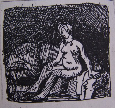
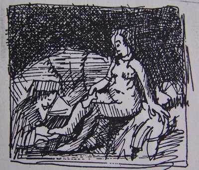
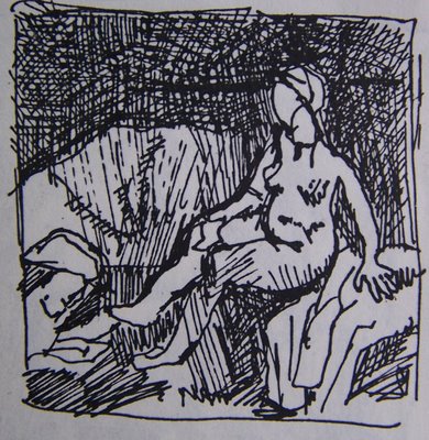 I made little drawings after Rembrandt's Bathsheba. I like the old masters, like getting to know their images through drawing. These particular drawings are very small, made carelessly with a pen, in large part just for fun.
Degas said "Il faut refaire la meme chose dix fois -- cent fois." I think redrawing a thing many times teaches you how to understand the things's qualities.
I suppose I could try drawing the Rembrandt one hundred times ... but I just drew it three times ... and that was great.
Computer Design
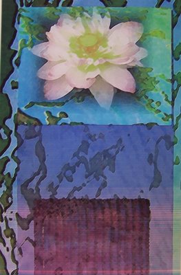 Some of the images I use in painting are first designed on a computer -- or else I will manipulate my own images on a computer. Sometimes I put images I made myself ("by hand") into a computer program and manipulate them graphically and then use ideas from the alterred image to further develop the hand drawn original. The give and take between hand made and computer designed can get all mixed up. But ultimately I paint everything -- because I'm a painter and that's finally what I really care about and love.
Verso and Recto
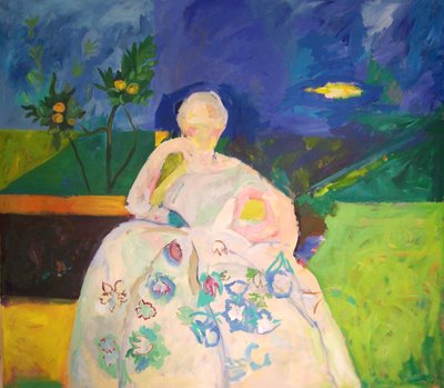
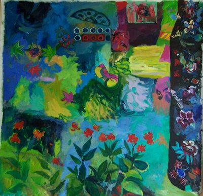 These two large paintings "Woman in White" and "Garden with Singing Bird" are verso and recto. They are both painted on the same piece of canvas. Whoever buys this gets an interesting "twofer."
A sense of the scale can be seen a few postings down where "Garden" is propped in the studio with two other garden paintings.
Installation getting crowded
 I thought I had a large studio until I tried to put all the "garden series" pictures that I'm painting together. This was the first time I had seen them in relationship to each other. The most recent "Garden with Singing Bird" is seen on the far left. Drop cloths are spread around the room for work underway -- as well as various toys which are spread out for play (as the artist's kid has play projects underway).


